On rebranding Korean Air

Recently Korean Air has unveiled the refresh of their branding and livery. When I got the news just a night before their official release, that someone captured the plane with the new livery landing on the airport, I first it looked alike the KLM’s. Like others, I emotionally missed the old, classic one.
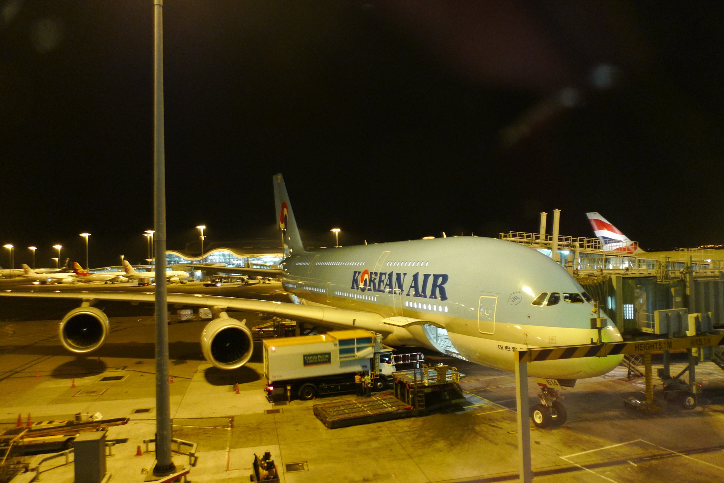
Korean Air is one of my favourite airlines due to its cheap air tickets (when I was living in Hong Kong) with good services and foods. I also love their livery, especially when most airlines prefer white on their aircraft bodies.
The livery and branding, after 41 years, is still lovely.
I didn’t study anything related to design, marketing or branding, but know that branding is not an easy task but an ongoing process. Branding is much more than creating a logo in a few seconds because your logo has to fit in as many circumstances as possible, especially when social media is more prevalent. Branding is like creating a entirely new language system and vibe which encourages people to focus on and even enjoy their own world. Together with various experiences from exposure on social media to flying, branding can link to various parts of one’s life, and thus shape one’s unforgettable memories, identity and sentiments.
So branding and rebranding have a lot of work to do, especially a series of testing in different situations like below. Images captured from their official video about rebranding their corporate identity: Insider stories [New Corporate Identity].


Branding is so powerful. As I grew up in Hong Kong, the TV advertisements of Cathay Pacific in 1980s and 1990s encouraged me a lot in terms of my life and national identity.
Rebranding is always challenging when the current branding is good enough. Rebranding is needed not necessarily because there is room for improvement. When I look at the 40-year-old livery on the modern Boeing 787 and A350 as well as the 21st-century cabin design, even though it’s not bad to make me think how Korea has progressed these years, I question if the exterior and interior can better match to each other.
After a few days of the release of the rebranding, the new livery is no longer as ugly as I think, like when I first looked at the minimal Cathay Pacific. The sentiment of “good old days” is inevitable, but I believe the new Korean will not be here to convince us that the new lively is better than the old one. Rather, rebranding will lead us to appreciate the classic past, so that we can better enjoy the present and look forward to the future. Time will tell.